Netherland’s favourite parking app
Goal
This project was part of the EasyPark's global effort of bringing all group apps under a single platform and brand. The Dutch market was particularly challenging due to local functionality that users were extremely attached to.
Outcome
The launch was successful. Conversion in the main flow was kept at 95%+, with a task on time of 3 seconds and very small churn. Based on user feedback, additional features was added right after the first release.
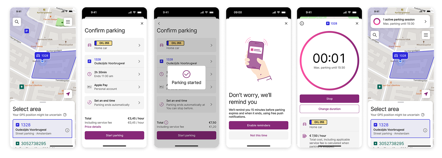
My contribution
The Dutch users' mental model was fundamentally different than our global parking flow: for more than 10 years, people opened their app and just tapped “start parking”. Many users forgot to stop their sessions, often overpaying. My role was to find solutions that balanced Dutch users' needs, while introducing EasyPark global solutions. I’ve tried subtle and expressive things.
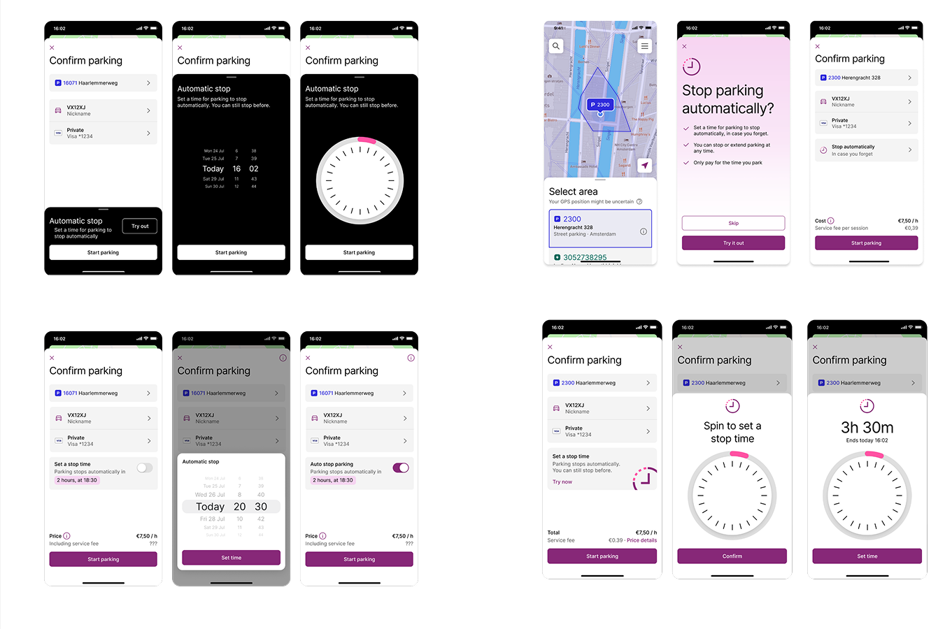
Explored a multiple approaches early on, using different angles for offering the feature of setting an end time.
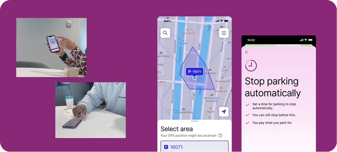
Tested first versions with users from Amsterdam and Rotterdam, in the office. They weren't big fans of the pop-up version asking them to set a time for their parking.
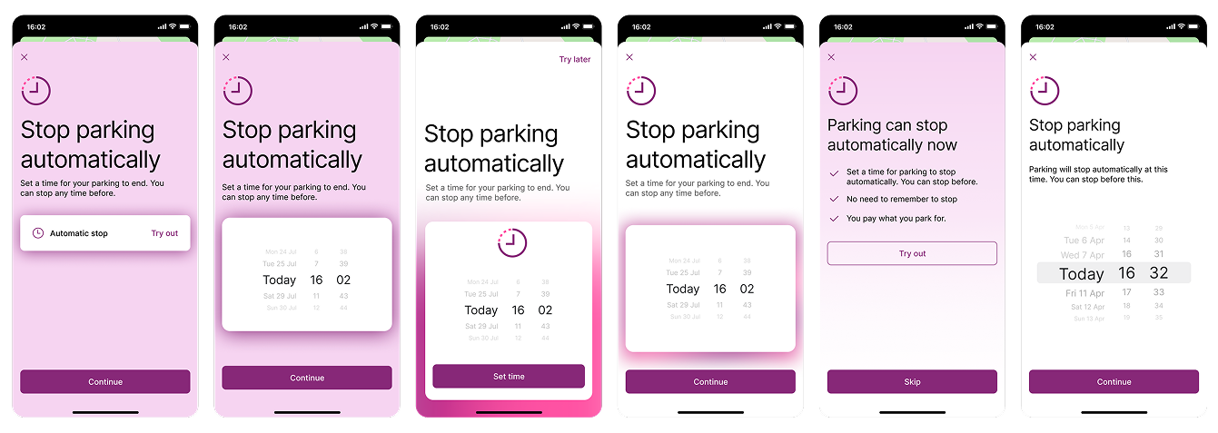
Explorations for the pop-up
I've facilitated user studies together with UX researchers and got reactions from Dutch users on the early concepts above. This consolidated insights about their mental model and current pain points, while informing us on the direction.
Shortly, users hated having to set a time in advance. Skippable pop-ups were alright, but rarely perceived as bringing value. We did discover a few scenarios when setting a time becomes useful, e.g. doctors' appointment, office day, or long term parking.
Next research used complex prototypes that I made in Protopie, together with UX writers. These concepts matched users' mental model of simply starting, with an optional end time. These were perceived much better.
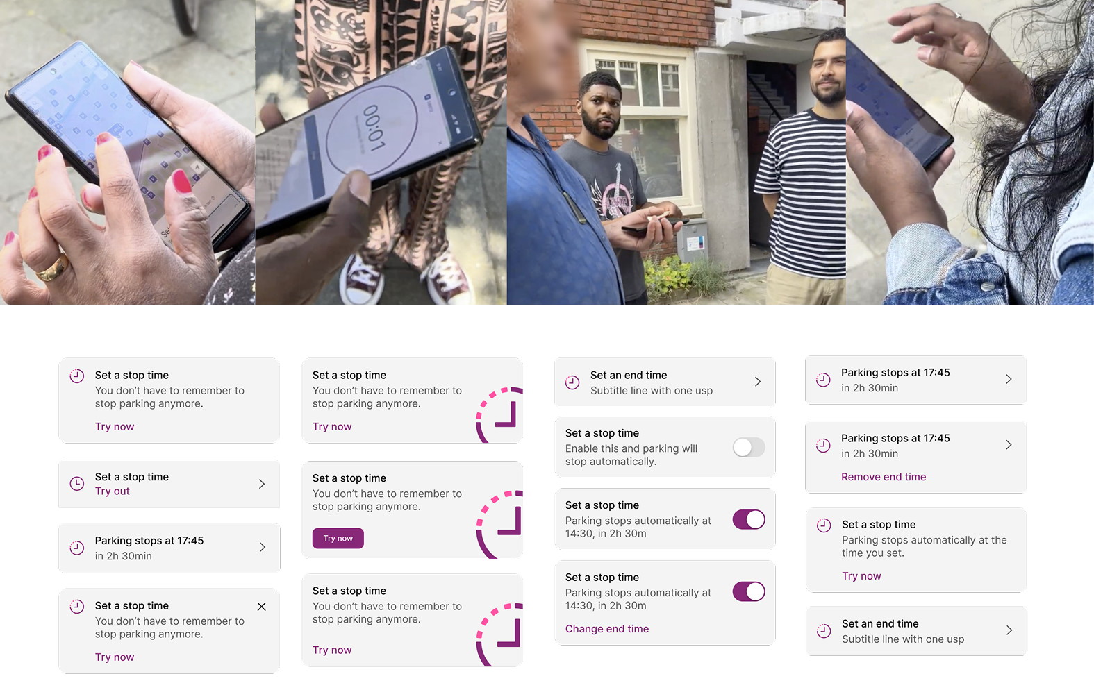
The field study focused mostly on the map (another team), and observing people's reaction o the more subtle set end time feature.
Detailed explorations of a smaller element to be integrated in existing steps, rather than using disruptive pop-ups. My favorite was the toggle enabling a default.
My tasks than shifted to facilitating internal alignment across our leadership, together with the product manager and tech lead, since we aimed at introducing a big variation specifically for the Dutch market. Insights from research were extremely valuable here.
Then, focus shifted on making sure that we are re-using as much of the global flow and design system components as possible, while matching insights about users' needs. Several design iterations and rounds lead to a version that was gradually released in the market.
The launch was successful, and while monitoring the release we received user feedback regarding missing functionality, in Android: foreground services. The team got together and did a great job enabling the feature within a couple of weeks.
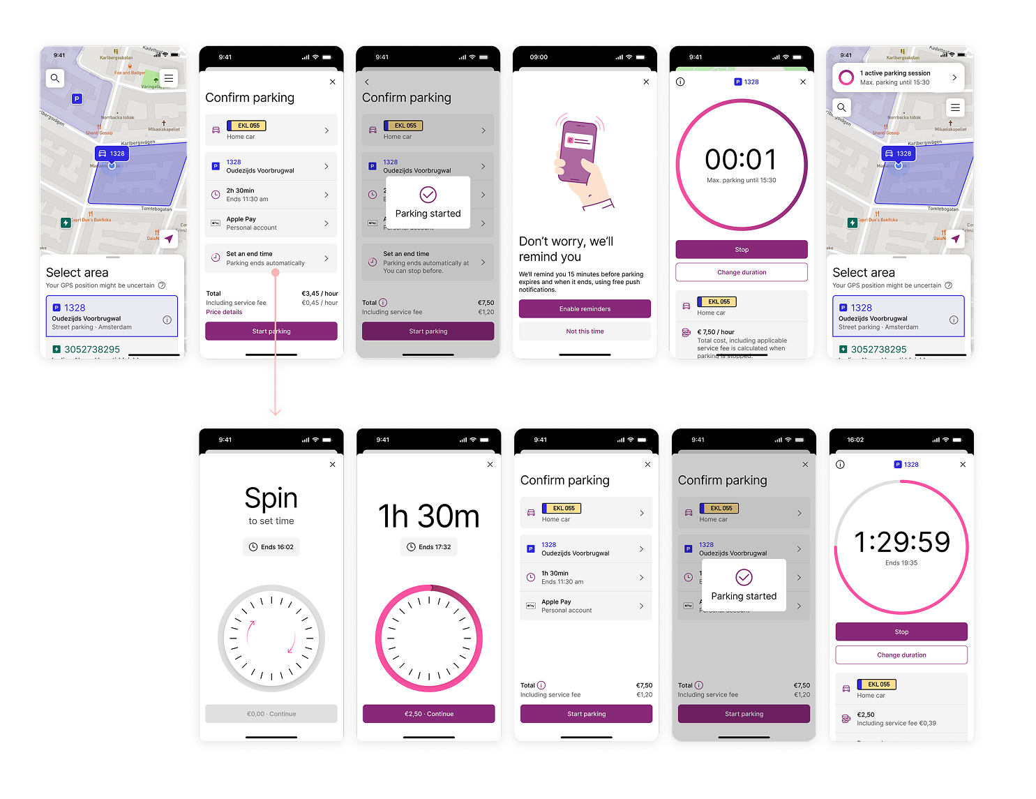
This first release focused on Dutch users' needs with the global parking solution as a secondary action.
Things I learned
- Since I've also been part of designing the former app that was being replaced, I've become a point of contact for other teams involved, which was more work than expected.
- Power users can also be more vocal than the rest of the user base.
- Gaining insights on what people don't like is just as valuable as understanding what they like.
- Working with UX writers was eye opening.