Redesigning parking across US
Goal
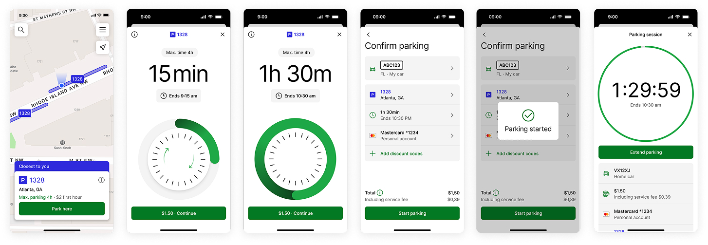
Parkmobile, part of EasyPark group, has been present in the US market without updating its products in years. The goal was to improve the app, address main user challenges, and get it to be consistent with global solutions recently launched in Europe.
Outcome
The app is now consistent across Europe and US, in terms of user experience and technology stack. Conversion in the core flow was kept steady, several issues were addressed, but more iterations are needed to ensure user retention.
My contribution
Initially, I was responsible for designing the way people start and manage their parking sessions. Towards the end of the project, my role changed from Senior to Principal Product Designer, broadening to the entire app experience.
Since the market was relatively new to most team members, the effort started by discovering the current state of things:
- Mapped existing user journeys, highlighting differences from EU, e.g. the car is used for a larger variety of needs in US.
- Worked closely with product and tech to map differences in the experience from what we've built in EU.
- Analysed funnels and usage data to improve on drop off points, e.g. better checkout with discounts, clarify rules, pricing and tariffs.
- Facilitated complex field studies and basic research throughout the redesign
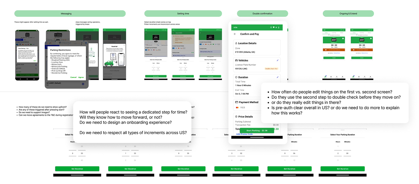
Presentations, and slide decks, images from on-street testing.
Harmonising needs and solutions across the entire country became a crucial part of the work. This meant collaborating with product managers, account managers, and data analysts to get to the core reason and effect behind unique solutions.
At the same time, I worked with UX researchers and facilitated focus groups to understand generic needs of users in the US, and get their input on our existing products, very early on.
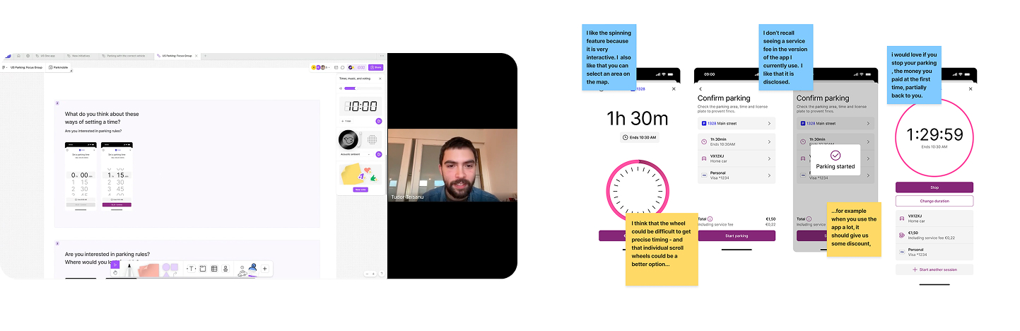
Used a combination of available European solutions and early ideas to get quick input from users in the US. FigJam proved challenging to use for people, at times.
Insights combined with the business need to harmonise solutions led to creating initial flows and hypotheses. I decided to spend my time exploring aspects that introduced the most change to their experience, like the time picker or payment process.
For example, I realised that the wheel interaction wouldn't be feasible everywhere due to inconsistent time configurations — paid parking in one location in Boston is billed every 15 minutes, while a neighbouring one can be every 33 minutes. This led to exploring other solutions.
I kept adjusting these flows by running user interviews in the office, and clickthrough prototypes in Maze. Facilitating these gave me first-hand input on people's reaction to the new app. I also contributed to other parts of the app, like the map and splash screen.
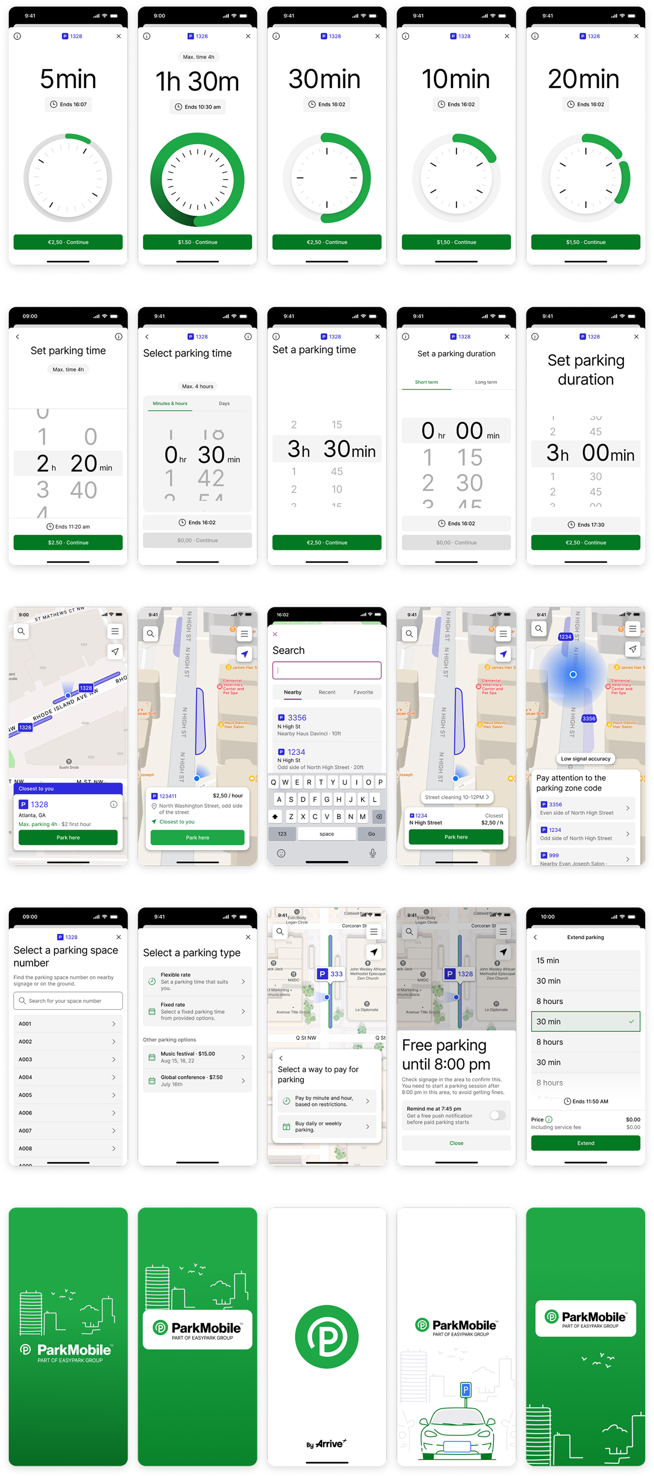
Top to bottom
- Explored different ways to communicate specific time increments in the wheel.
- Explored a time picker closer to the native one, for irregular increments.
- Different takes on the map, part of a design sprint to improve this part of the app too.
- Handling specific use cases: selecting a number, a tariff, or a fixed duration extension.
- Contributed to splash screen designs as well.
Then I had the chance to facilitate a field study, driving and parking together with users in Miami. I prepared complex prototypes in Protopie and a beta version of the new Parkmobile app, together with developers.
The new app was launched, and the core flows performed well. However, as we learned the hard way, maintaining frequent users' information and preferred functionality during a major update is critical. Missing this led to negative reviews, and a need to quickly iterate across the app.
These cross-team improvements came in as I transitioned into my new role, leading 7 product designers.
Along the way, we also found features that would bring value and delight to users, that weren't built right away. I worked with the head of design to create decks presenting long-term visions around these features.
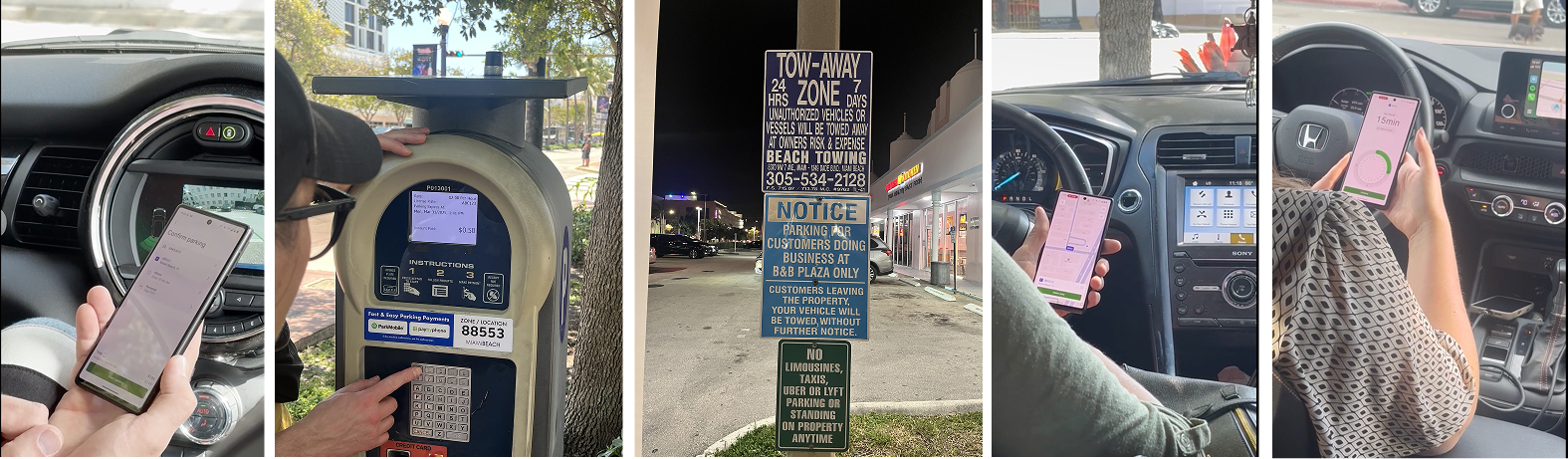
Used the beta version for complex research in the field, and clickthrough prototypes to identify quick iterations online.
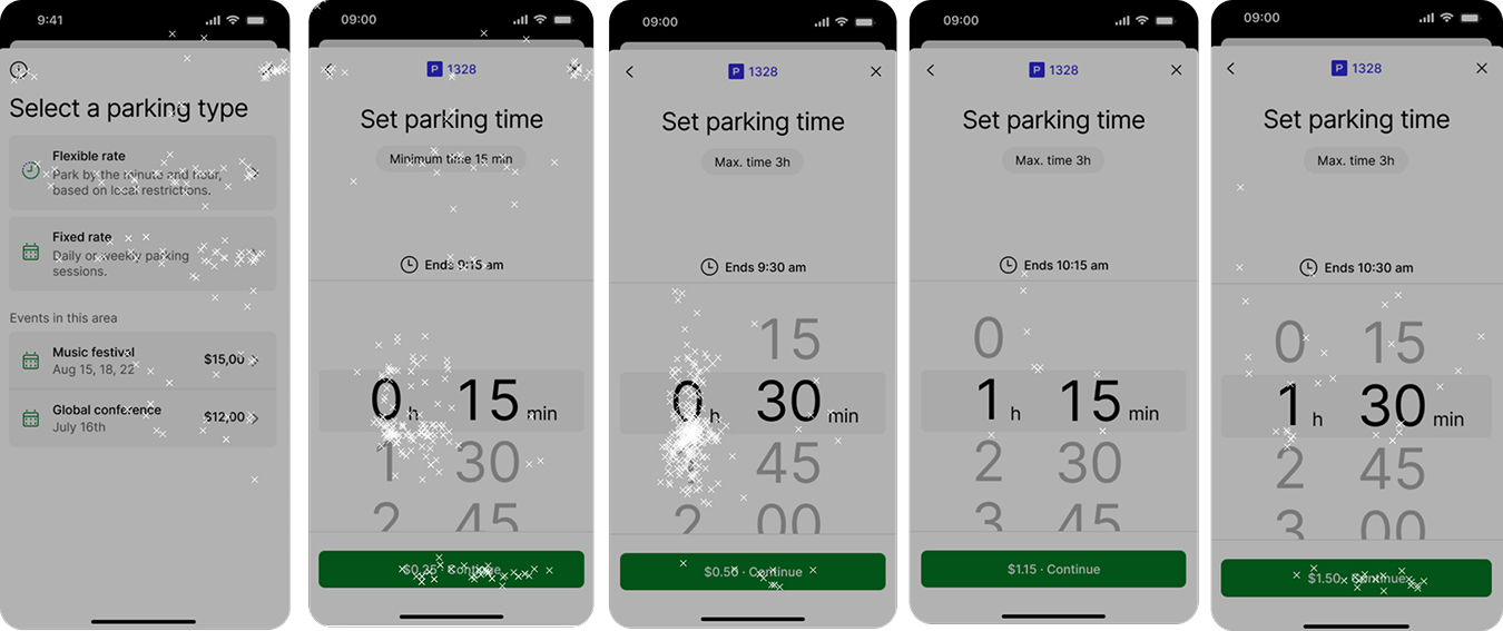
Used Maze testing to see how people interact with the new flow. In the end, I moved the “ends 9:15am” label lower on the screen to draw less attention.
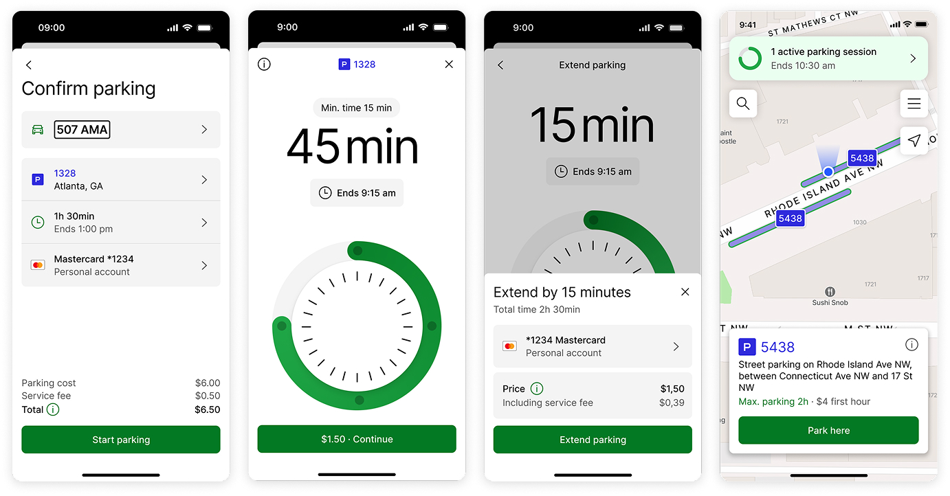
Combining insights led to a series of changes. From left to right: adding more clarity around costs, adding indicators on the wheel to show time steps, offering a payment change while extending, and increasing visibility of the active session on the map.
Things I learned
- Users' experience should never be compromised on a local level, for the sake of keeping the experience perfectly consistent globally.
- Introducing new functionality exponentially increases complexity, both for users and the business.
- Keeping users' account information intact during a major update is crucial.