Reservations for airport & event parking
Goal
A new business opportunity for the company. Initial work had already stalled two years before I joined. The challenge was influencing a shift in behaviour: getting people to reserve a parking spot before leaving the house, using only the app.
Outcome
Reservations were seen as important by the business, and I led the UX end to end. The first release let people reserve a garage entirely in-app, but feedback we should have gathered earlier showed low traffic and no real market fit. We went back to the drawing board, re-ideated, and relaunched with a narrower, airport-focused scope. The next iteration is already in development.
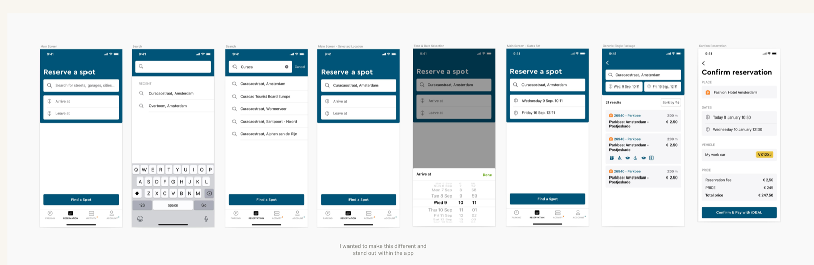
My contribution
My role covered usability testing, ideation, visual design, documentation, and dev support, working closely with the head of design and the product manager. I wasn’t part of early discovery; it had already been decided that this would all happen in-app only.
- Initial work had been started by a former designer before stalling for two years. People disagreed on the wrong things, and few interactions had been explained.
- Ran multiple sessions with POs and PMs to understand success criteria, mainly around transactions and planning.
- Filled a wall with screenshots from apps outside parking too, including how Booking.com’s landing page evolved from 2004 to 2021.
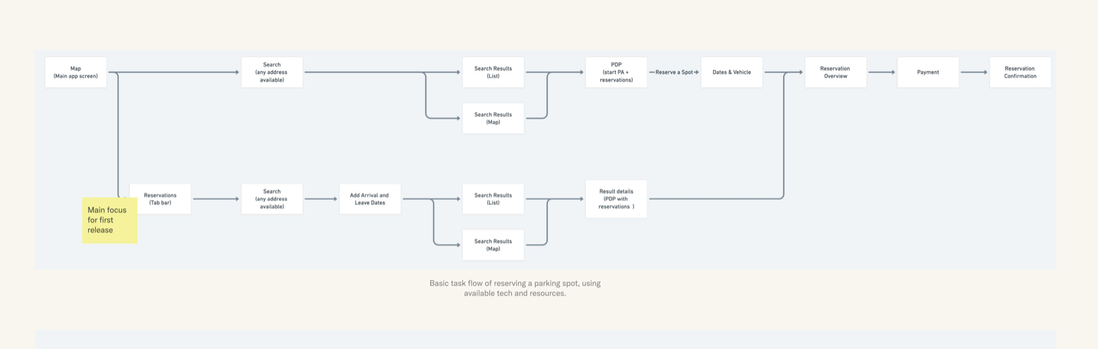
Re-started from the basics, focusing on tasks, to get stakeholders aligned, all based on initial research findings. I included flows that are often missed besides the happy path, like what happens when someone overstays a reservation.
The head of design and I went through existing wireframes and adjusted them based on the newly clarified flows. Then we decided to jump straight to high fidelity, using the new design system. The main assumption was that once released as its own tab, reservations would get a high amount of traffic and usage.
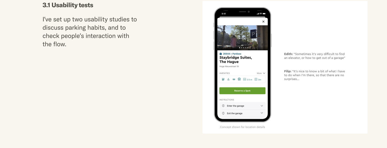
I set up two usability studies to discuss parking habits, and to check people’s interaction with the flow.
People’s entry point was different from the design: 7 of 9 participants tried pressing the search bar first when starting a reservation. They said that first, it’s about finding the location, then reserving a spot.
The numbers made it clearer still: a 75% conversion rate on the booking flow, but low traffic, under 75,000 users a year. Doing everything in-app simply didn’t work. It also highlighted the need to stop maintaining reservations as its own mini-app inside one tab; the next release moved to a single, shared code base.
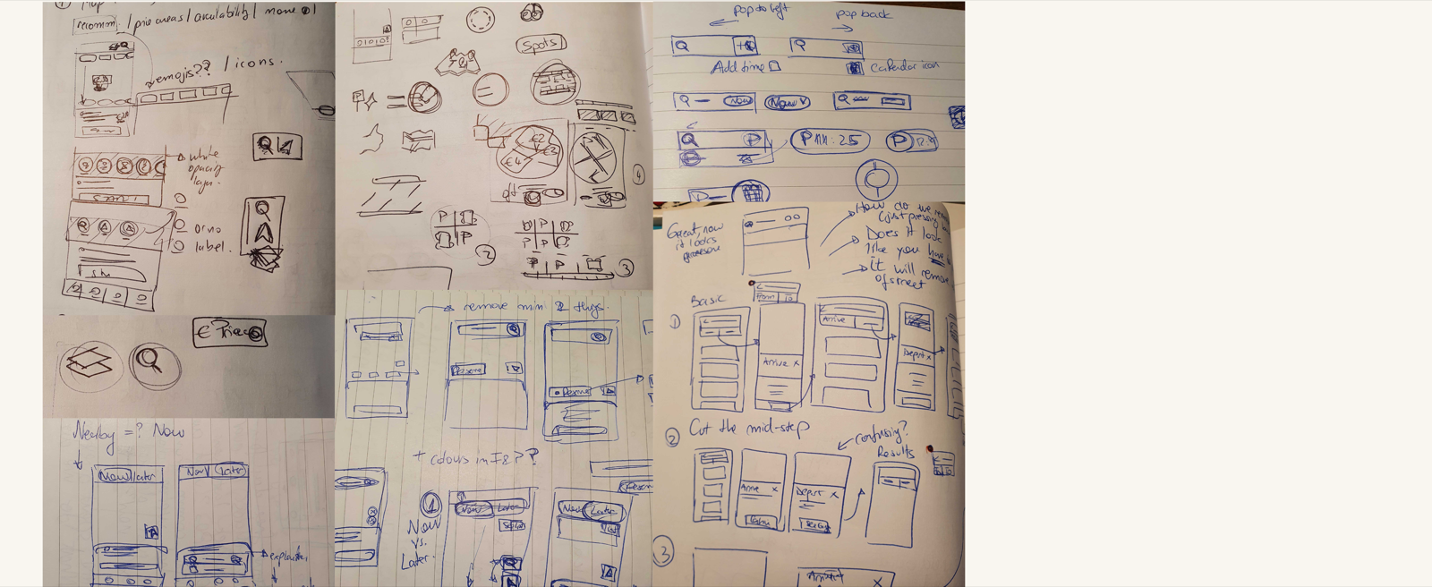
Definitely not pretty, but useful for quick explorations. Previous findings clearly showed a need to re-think reservations: how do I show people they can use this app for reservations, within their current interactions?
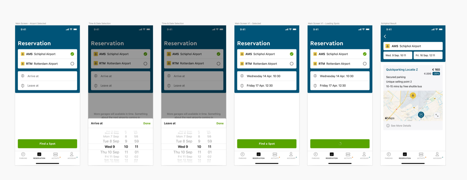
Instead of around 170 garages, only a couple of airports were made available at first. The main flow had to change, quickly.
Tested this again in a moderated session. Going to the airport turned out to be part of a longer, more stressful journey than expected. Specific location maps and shuttle instructions were added after this second study, and the pivoted flow was released as a first version.

The relaunched flow, scoped to Schiphol Airport reservations.
Things I learned
- Working with the same people for too long on a project can lead to confirmation bias. I need to ask for new feedback once in a while.
- Just because a new feature is added in the main area of a product, it doesn’t mean it will be used. Marketing, strategy, and more have to contribute to changing behaviour.
- People need precise and clear details if they’re expected to try an entirely new experience. “Just release” might do more harm than good here.
- Too many tech constraints will result in great compromises and a lack of flexibility along the way.