Building a design system during a redesign
Goal
Parkmobile was a digital solution for paid parking working in Netherlands and Belgium. The app was a market leader with 2 million monthly active users. It launched in 2011, barely changed in years; the experience and tech stack were not matching user expectations anymore.
Outcome
The app was fully redesigned, for Android and iOS. New flows are simpler, rely on data, native functionality and transparency. The new design was built in parallel with a design system. Within product and tech, we delivered a well documented system, aligned across Figma, Sketch and code. Through research, a good amount of findings surfaces strong cultural influences on users' expectation from a parking app.
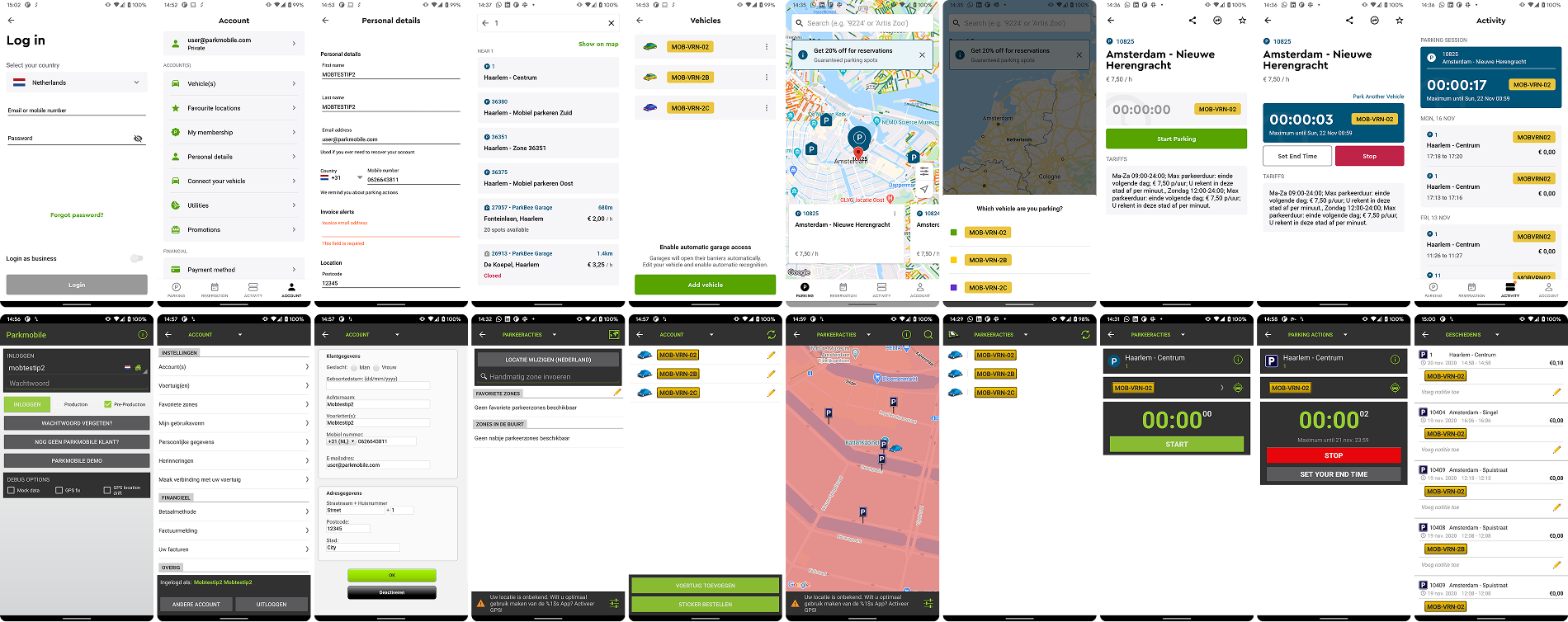
New and old app. Its core interaction was start in one tap. We eventually added a confirmation screen too, successfully.
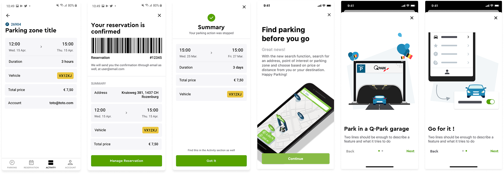
Contributed to a few isolated screens within different initiatives at first. Was good to get diversity first.
My contribution
Initially I've helped senior designers to turn sketches and diagrams into high fidelity screens. As my confidence grew by learning about users and the business, I've started redesigning entire flows and parts of the app being involved earlier in the process, while still providing input on visual direction.
I've explored many prototypes combining ways of displaying parking elements on the map, starting a parking session, managing a session and showing complex tariffs. The app hasn't been redesigned 10+ years, so balancing familiarity with the change in UI standards was challenging.
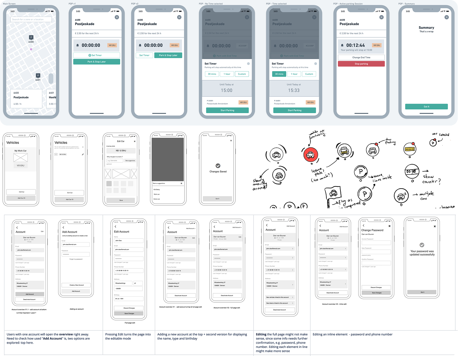
Early wireframes and sketches exploring the parking session flow.
My work combined exploring user journeys, facilitating research and high fidelity designs, often in parallel. I worked closely with several engineering teams, providing and getting feedback as we were building all this, iterating together. It quite some time to get into a good rhythm of upgrading these flows. The icon interaction and screen (left side with dark elements) was a large green button that simply started the parking session. As we discovered, adding an additional step to confirm, had positive effects and did not hurt conversion or retention.
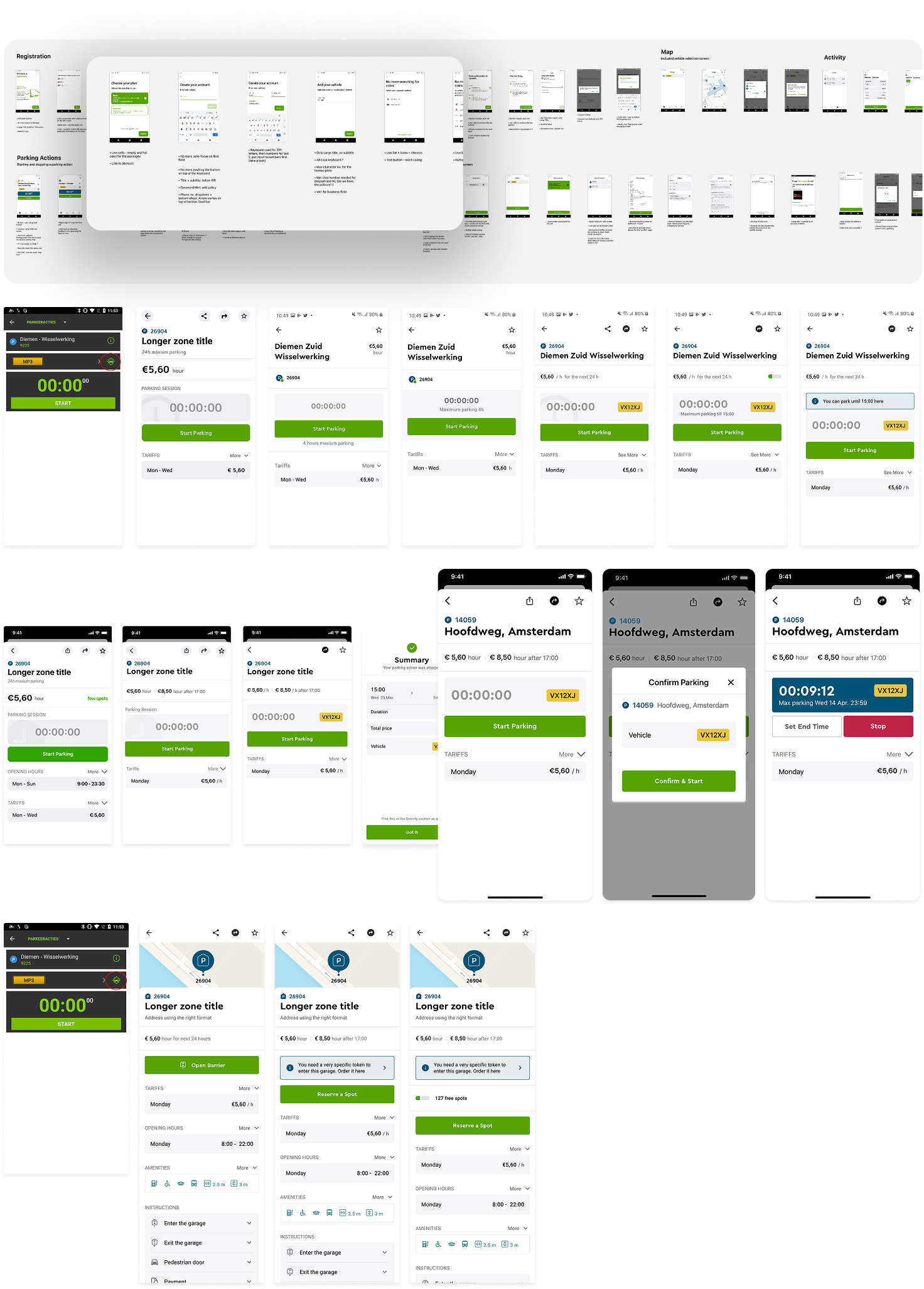
Top to bottom
- Tried quite a few ways to provide feedback to engineers.
- Designs explore different focus points: availability of parking, max. allowed duration, tariff explanation, map reference.
- We decided to go with a strong blue to indicate an active session. This was then used on map, and much later in the live activity. Nobody used the share button...so we removed it.
- Parking data is diverse across cities, location and even hardware in garage parking.
Throughout this work, patterns of components starting forming, which I've documented in a design system, using the atomic design structure. I've also pushed for establishing visual design principles among the team to ensure long term cohesion: centralised, strict, native, and practical.
I iterated on layouts, created flows from scratch and built on components based on research findings. This way, the system slowly started covering all scenarios, being used within the web B2B products as well.
Documentation became a big part of my work. I took the initiative to not only create individual elements, but to link them to behavioural patterns, like selecting a date range, searching, displaying a summary, or displaying prices. This required documentation around origins, versioning, and links to research findings. In the end, this encouraged developers, POs and management to actively participate in questioning and improving the system. We had a pretty nice glass wall where we kept printing designs, triggering discussions as people walked by.
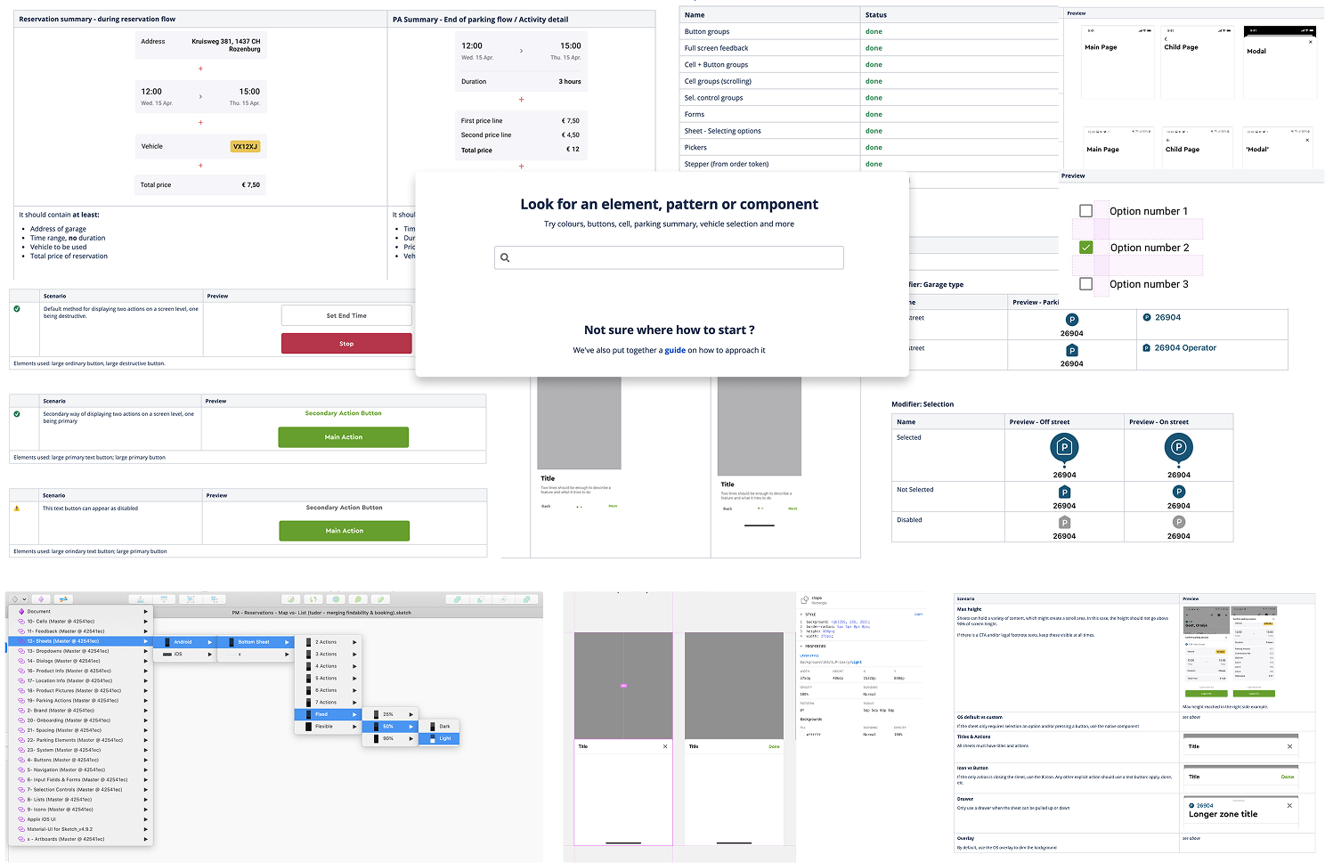
Documentation was done in a mix of Confluence, Sketch (then Figma) and Abstract. Also worked on a Sketch plugin that automatically turned UIs from light to dark. Iterated quite a lot on the structure of the library as well.
Most of the research was done in labs or our office. I was missing data from the field: light conditions on phone screens, motions, levels of comfort, and distractions people get to experience. I took the initiative to conduct research in context by jumping in the back seat to observe people driving and parking.
The study was set up as a qualitative pilot, taking place in and around a participant's car. The main task was to drive to a paid parking location and park using the app, with a pre-interview, observations in the car, and a short post-interview. From past experience, asking intricate questions during the driving itself can easily result in collecting false data.
The pilot resulted in exciting video based findings and clear next steps for the full study. It pushed the team to improve core areas of the product. A specific example was changing the interface as a user was getting closer to a parking location vs. checking it out at home; differentiating planning from daily usage.
Overall, the app was successfully redesigned, with strong research findings fuelling more innovation, and a robust design system to back it up, which was immediately used by developers to build flows independently (to a degree).
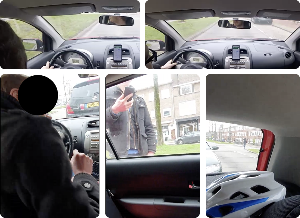
The participant got out of the car to double check the parking area, as the product instructed in its old version, while parking in an unfamiliar area - I did not interfere at all
Things I learned
- Little details in people's lives can make or break their day - in this case a parking app functioning correctly is unnoticed. However, if it makes them spend 15 minutes while trying to finish something else, it becomes an issue.
- Honest, early feedback helped in adjusting design solutions and aligning with the team. Defensive, grumpy attitudes discouraged me to continue.
- Documentation was crucial to keep development teams aware of changes, gaps and future improvements.
- 1 field study was incredibly useful at informing the design process, but they must be supported by quantitative data.