Volunteering for a start-up
I offered my skills to improve a South African start-up delivering goods to rural areas in the country.
Work Done
Off the shelf is an e-commerce start-up focused on selling and delivering goods to people throughout South Africa and Zimbabwe. Compared to other services, they wish to make the website accessible for less developed rural areas in the country.
Analysis
Analysed the current state of the website and brought feasible solutions for the short term.
Redesign
Started an effort to redesign major areas on the website, focusing on mobile first.
Initial Logo
Collaborated to create a new logo used currently in their products.
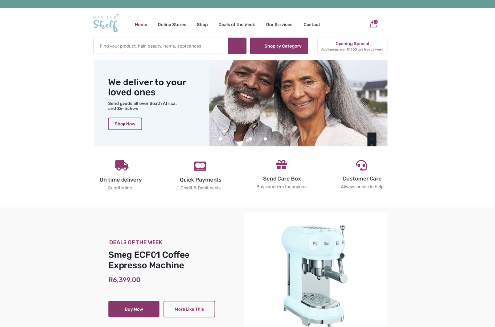
e.g. the work started with generic analysis, then changed to individual elements — all based on existing identity and development capacity.
Goal
The founder of the start-up, a lady who used to run a few physical brick and mortar shops, found my Instagram page, by accident. She asked whether I can provide some feedback on the design on the website. However, I was really interested in the idea she was developing, I decided to volunteer my skills to try to improve their product. I was also interested in practicing some more web design, and to learn about South African design culture and people’s everyday lives.
Process
The first thing that struck me was the amount of information presented in all areas on the website. I decided to focus on the home page first. Their vision of helping people from less developed areas, as well as selling products to everyone else got lost among all that content.
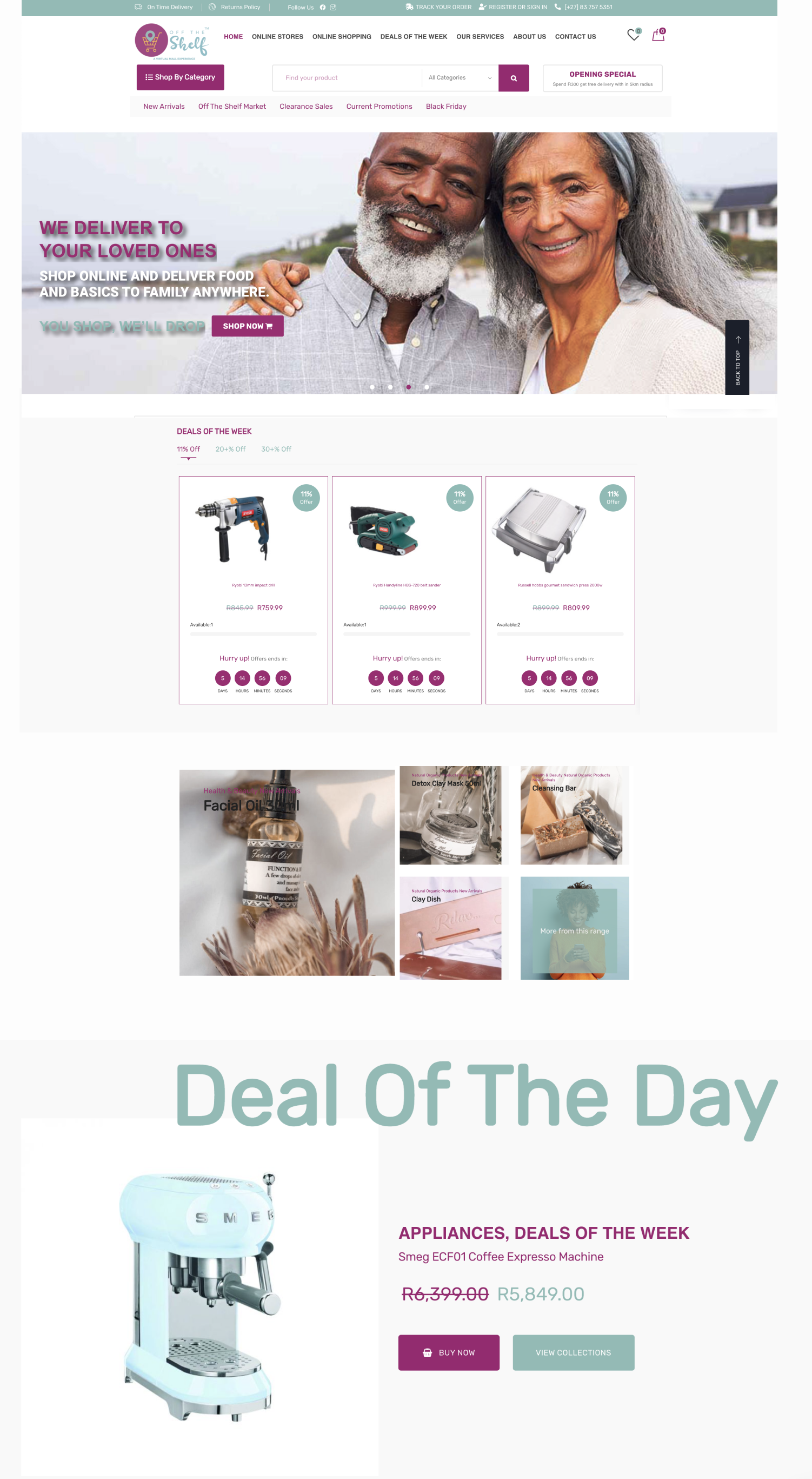
old website, it also had a footer section with subscriptions
I analysed all the content in the home page, with proposal of what could be easily improved or simplified. These first suggestions followed basic design principles to increase the website’s ease of use. Next suggestions would need more testing, context and data about the users.
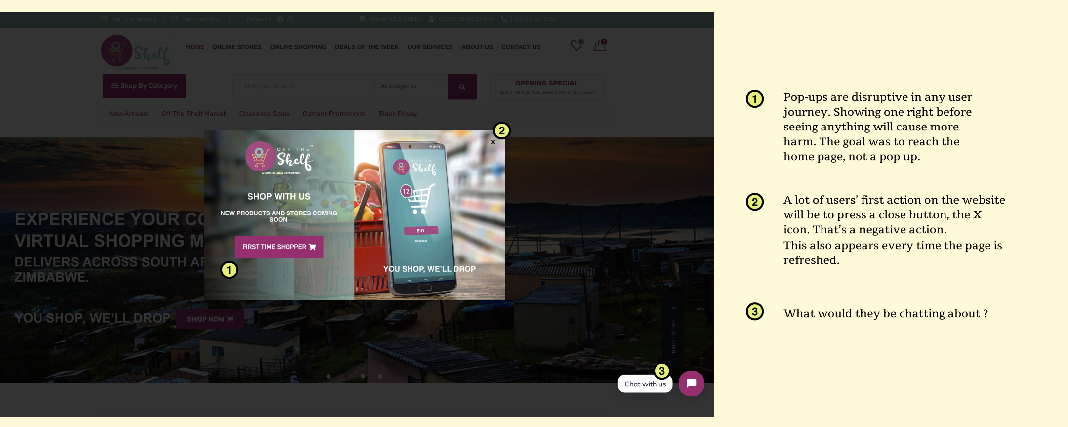
the website used to start with a pop-up; it was removed by this time. The analysis followed this format.
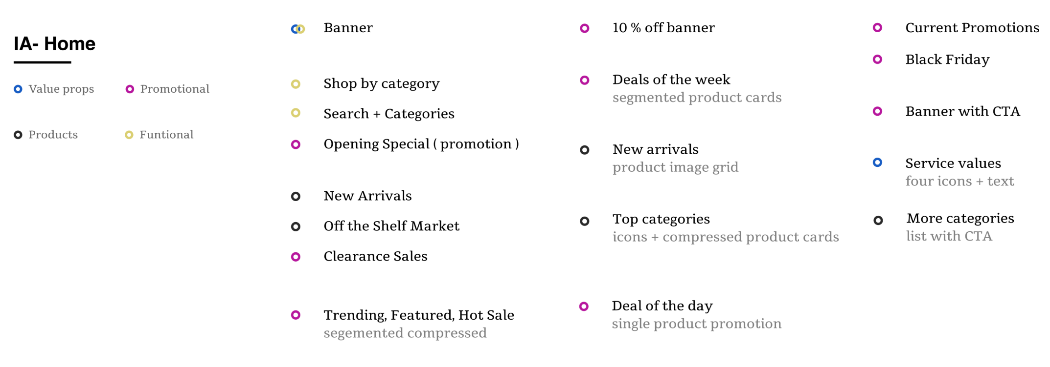
also looked at the information type and amount — to present them in a visual format
Then, I looked at the type of UI components used throughout the home page and the website. I’ve started a small collection of variations, to see which ones can be removed or replaced. This was going to help their visual consistency, when displaying similar type of info in different places.
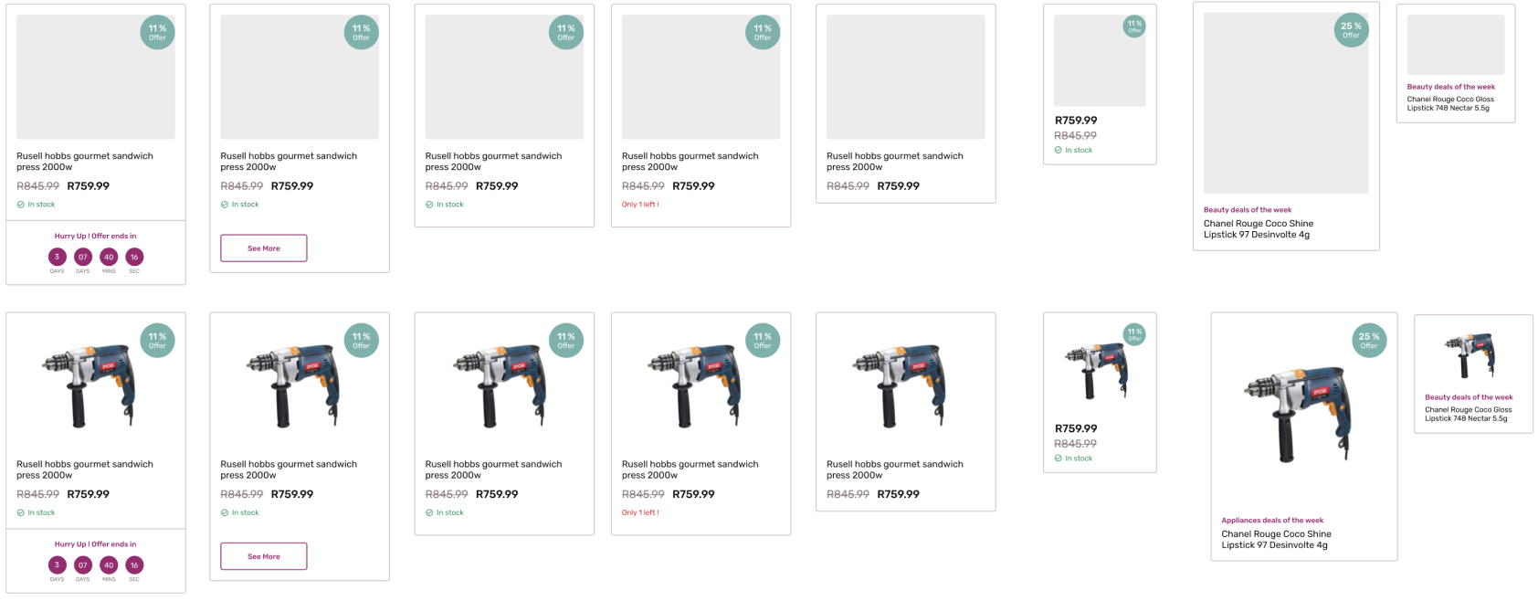
collected all product card types used and improved their usability
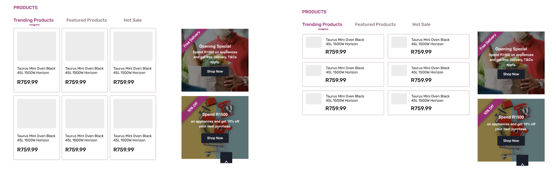
also provided alternatives to existing sections
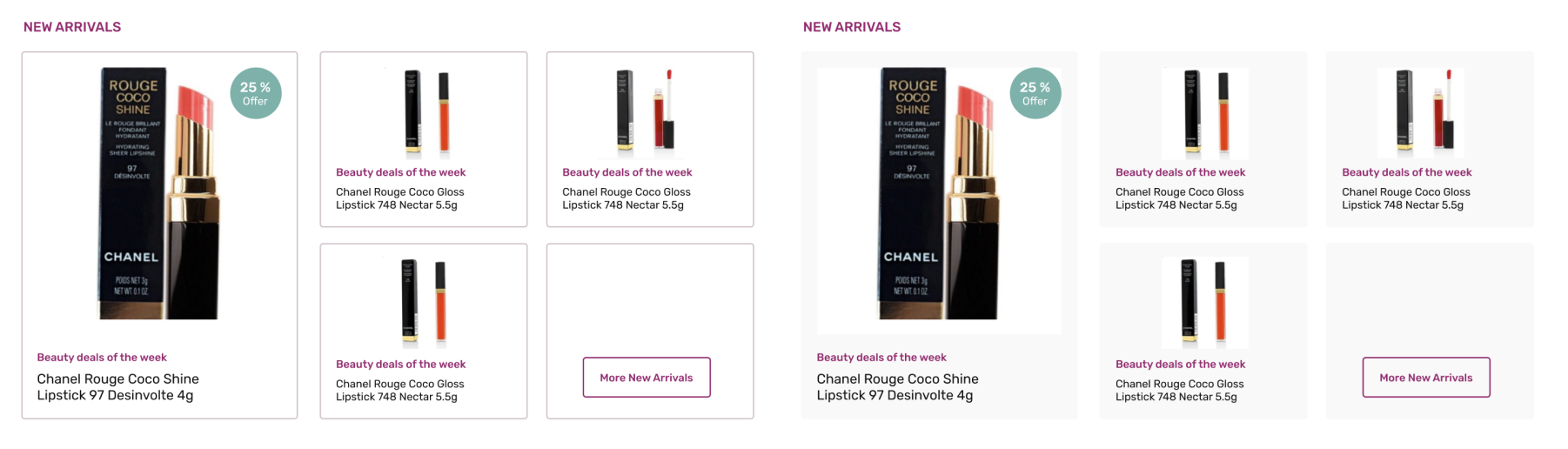
most changes are minimal to keep the development effort small. Most of them are font size increasing, colours with better contrast and consistent layouts.
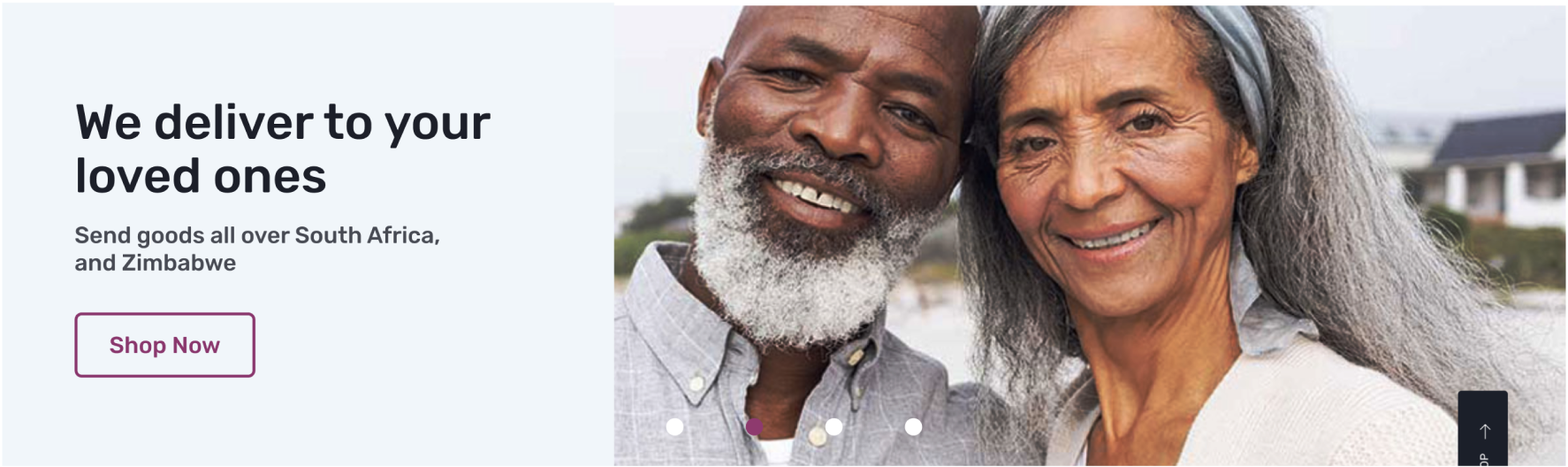
also worked on the main banner - increasing visibility, using the same pictures
I was going through these changes, gradually with the developer and the founder. They were extremely open to the ideas and immediately reduced the amount of sales-like content on the home page. Most of these changes are already visible in the live version. I also tried to simply the logo — another change they welcomed.
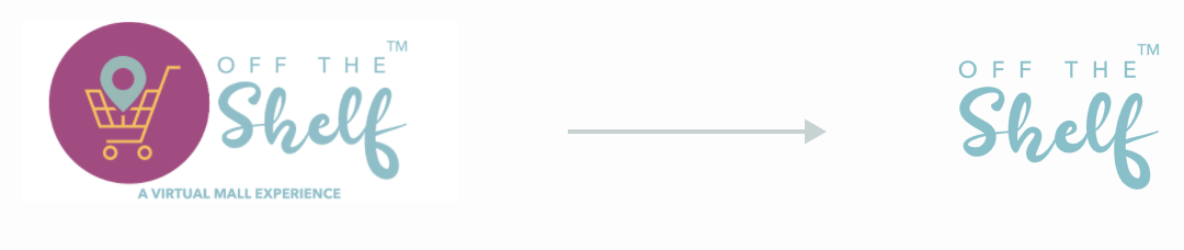
the small text was impossible to read and the shape doesn’t bring any value to the logo. The type play worked perfectly well for a first version.
I took all these components and created versions of the home page on desktop, to help the company decide on the type of content to be presented. It was much easier to analyse strengths and weaknesses of different variants this way.
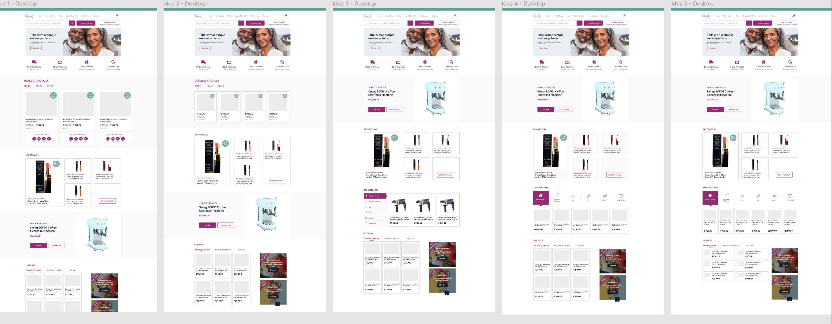
Generally, I focused on reducing the amount of content and paths people could take to reach a product on the website. I advise them to show fewer navigation items, and simply highlight the search and category items first. The need to really simply navigation came from their stories of potential users. Besides young tech adopters everybody creates websites for, there are people in South Africa with a low income lack of education, who could access online services to order food, appliances or healthcare products.

old header section

new header section — a few things still need to be solved, but a few quick fixes made the top part of the website much more clear.
After deciding on a version, I had a look at the responsive behaviour of the website. This was quite buggy and the mobile version required quite a lot of re-work.
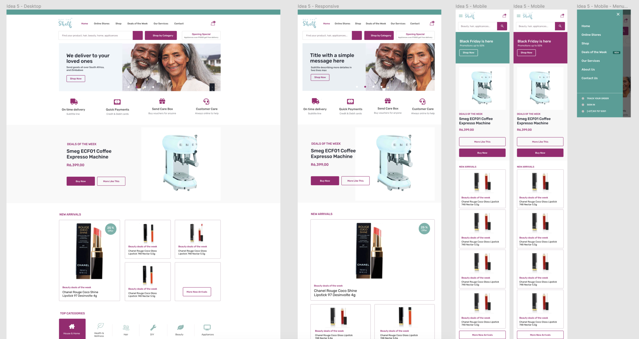
there was an idea from the social media content creator to replace the image slider with a single colour banner, potentially with an image too.
My work is ongoing at the moment, with one or two weekly meetings. We either discuss ideas I had to improve the website, or analyse the pages/areas they wish to improve, knowing their target audience, goals and culture more than I do.
Lessons Learned
- I started getting involved much more than I originally thought. It was not about design anymore, but about helping the cause in every way I can.
- It has been highly rewarding to work as a volunteer.